Category:
Brand Design
Project Name:
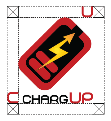
ChargeUp
Duration:
4 weeks
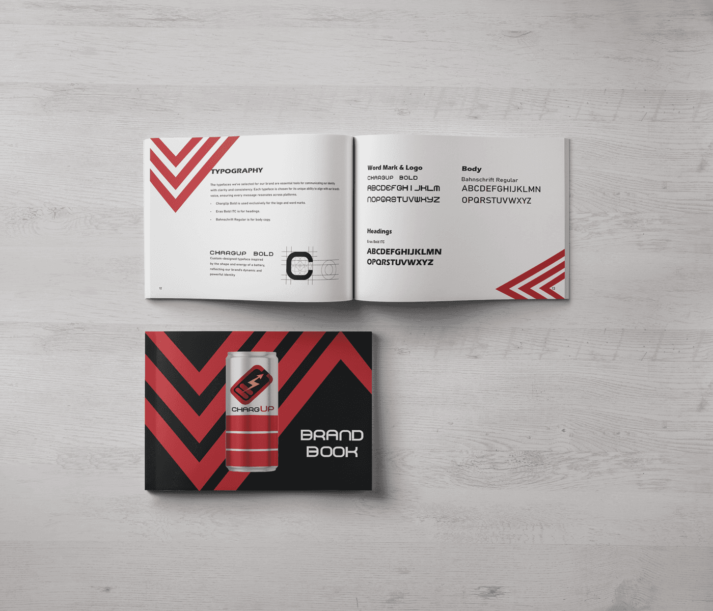
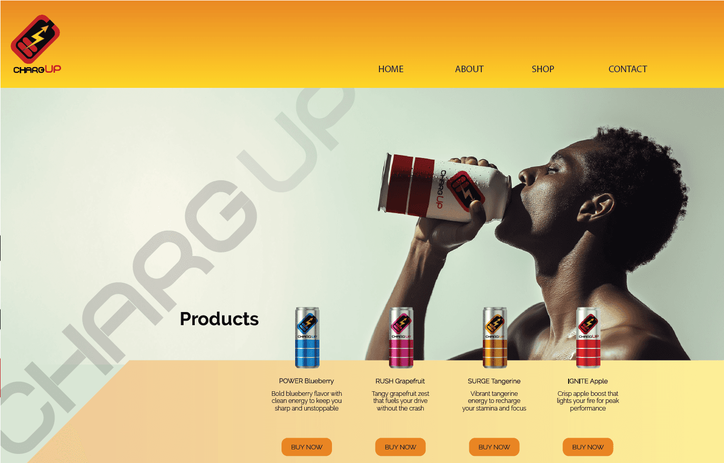
This project introduces the strategic concept brand design of CHARGUP, an energy drink, to create a vibrant and consistent visual identity. The brand book establishes that CHARGUP's identity is not just a logo but is defined by public perception and consumer experience. It positions the brand as a community-focused entity built around the concept of harnessing our collective internal energy.
(MY APPROACAH)
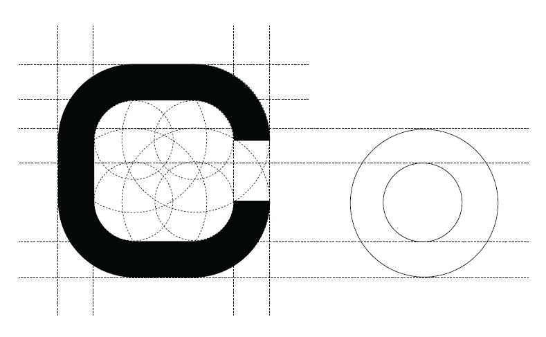
The approach involved creating a comprehensive and cohesive visual system to ensure brand consistency. This included designing a core logo that is the "heart and soul" of the identity , a purposeful color palette with names like "Ignite Red" , and a custom typeface inspired by the energy of a battery. Strict guidelines were established to maintain the integrity of the brand's visual assets.

(VISION & INNOVATION)
CHARGUP's vision is to be more than a beverage; it aims to be a catalyst for building community and fostering connections. The brand is envisioned as a living entity, shaped by its users. The goal is for the CHARGUP logo to become a symbol representing the people who make up its community , creating an exciting world around the product.

(CHALLENGES)
The primary challenge was ensuring brand consistency across all partners and platforms during a major redesign. The project also addressed the need to prevent brand dilution by establishing strict usage rules for the new logo. A key conceptual challenge was to successfully shift the brand's focus from being a product to being a community-centric entity whose identity is owned by the public.
(PROBLEMS)

(USER-CENTRIC DESIGN)
(USER NEEDS)